



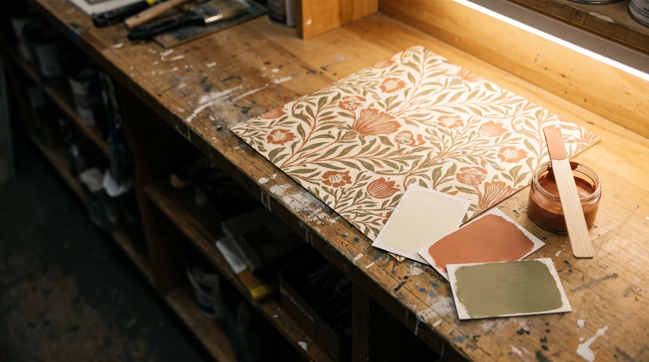
There is no formula for a wallpaper pattern, so we read its colors.
A paint code can be looked up. A printed paper can’t. There is no catalog entry for the exact ground behind a botanical, or for the second color in a stripe. So we put the paper in daylight, find the ground color and the accents, pull Benjamin Moore candidates against it, and narrow them until the pair holds together on the counter. Then we mix.
Order
Pattern first, paint second. The room then reads as one decision instead of two.
The paper is fixed. The paint isn’t.
A wallpaper pattern’s colors were settled the day it was printed. Paint is whatever we mix. So pick the paper first, then match the paint to it. Choosing the paint first means hunting through thousands of patterns for the handful that carry your color.
And wallpaper is almost never the whole room. There’s a ceiling over it, casing and baseboard beside it, a door in the wall, and usually three more walls of plain surface. Every one of those is paint, and every one of them is judged against the paper the moment someone walks in.
Counter
What happens when you put the paper down.
01
We find the ground
The ground is the color the pattern is printed on: the field behind the drawing. It is the largest area of color on the paper, so it is the one your eye averages the whole wall to. In most rooms the adjoining walls take the ground color, or a step off it.
02
We pull the accents
Then the two or three colors doing the drawing: the leaves, the flowers, the darkest line in a stripe. These are the trim, door and cabinet candidates. An accent pulled off the paper at full strength is usually too much on a whole wall and exactly right on casing.
03
We check them against the paper
A fan deck chip is small and printed on card; wallpaper is large and printed on paper, so a chip held up to a pattern can mislead. We lay the candidates against the sample in daylight, and on a close call we suggest a sample pint brushed out at home beside the paper.
04
We mix it in the right line
Once the color is settled we spec the Benjamin Moore line for the surface it is going on: walls, trim, cabinets and ceilings each have a different answer. Color and line are two separate decisions and we make them in that order.
Bring with you
- The wallpaper sample or the borrowed book: the paper itself, not a photo of it
- Rough dimensions of the room, and which walls get paper
- A photo of the room with the furniture and flooring in it
- The trim color you already have, if you're keeping it
Walk-ins are welcome. The counter does this every week. If the room is complicated, or the paper is going up in more than one space, book an in-home consultation and we’ll work through the whole plan in the room.
Book an in-home consultationPattern
An undertone mismatch is invisible on a one-inch chip and obvious across eight feet of wall.
Three colors do almost all the work.
Most patterns come apart into a ground and two or three accents, and those give you the room’s palette. The ground goes on the plain walls, either matched or lightened a step so the papered wall still steps forward. One accent goes on trim and doors. A second accent, if you want one, goes somewhere small: the inside of a cabinet, a powder-room ceiling, a single door.
Undertone is where most pairings go wrong. A pale ground carries an undertone, and a wall painted a color with the opposite undertone will look wrong beside it, though no one can say why. So we check candidates against the paper itself, in daylight, instead of trusting a chip.
Walls
Screens vary and paint shifts with the light in the room. Pick up a sample before you commit to a wall.
Where the counter starts.
These four are the colors we reach for beside a papered wall. They are a starting point. The answer comes off your paper.
Sheen
Matte and eggshell on walls. Satin and semi-gloss belong on trim, doors and cabinets. Ceilings stay flat.
Match the color, then match how it holds the light.
Wallpaper is close to flat, and the paint beside it should be too. On the plain walls next to a papered one, use matte or eggshell: matte if the room is quiet, eggshell if it is touched and needs wiping. Anything glossier reflects enough light to make the paper look dull beside it, and the eye reads that as a color mismatch.
The higher sheens have a place, and it isn’t the wall. Satin and semi-gloss belong on trim, doors and cabinets. They take cleaning, they hold an edge against the paper, and the contrast in finish lets casing read as casing rather than more wall. Ceilings stay flat.
Light
Look at the sample twice: once in the morning, once around four.
Valley daylight shows every mismatch.
Houses here get more direct sun for more of the year than almost anywhere else, and much of it arrives already warm, bounced off decomposed granite, gravel and stucco before it reaches a window. That warm cast pushes warm colors warmer, and against so much warmth a cool color can read cooler than it is. It happens to the paper and the paint at the same time, though not always by the same amount. It is why the borrowed book matters: the pair has to hold in the room’s own light, not the store’s.
If the pairing survives the morning and the four o’clock light, it will survive the year.
Next
The books are on the racks. The tint machine is behind them.
Open a book at the store, take it home on a refundable deposit, and bring it back with the wall in mind.